import React, { useState } from 'react'
import { StyleSheet, Text, View, Image, Alert, TextInput, FlatList, TouchableOpacity } from 'react-native'

export default ContactsView = () => {
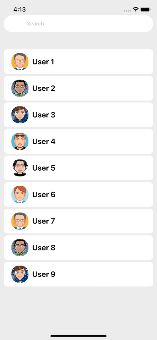
  const data = [
    {
      id: 1,
      icon: 'https://bootdey.com/img/Content/avatar/avatar1.png',
      description: 'User 1',
    },
    {
      id: 2,
      icon: 'https://bootdey.com/img/Content/avatar/avatar2.png',
      description: 'User 2',
    },
    {
      id: 3,
      icon: 'https://bootdey.com/img/Content/avatar/avatar3.png',
      description: 'User 3',
    },
    {
      id: 4,
      icon: 'https://bootdey.com/img/Content/avatar/avatar4.png',
      description: 'User 4',
    },
    {
      id: 5,
      icon: 'https://bootdey.com/img/Content/avatar/avatar5.png',
      description: 'User 5',
    },
    {
      id: 6,
      icon: 'https://bootdey.com/img/Content/avatar/avatar6.png',
      description: 'User 6',
    },
    {
      id: 7,
      icon: 'https://bootdey.com/img/Content/avatar/avatar1.png',
      description: 'User 7',
    },
    {
      id: 8,
      icon: 'https://bootdey.com/img/Content/avatar/avatar2.png',
      description: 'User 8',
    },
    {
      id: 9,
      icon: 'https://bootdey.com/img/Content/avatar/avatar3.png',
      description: 'User 9',
    },
  ]

  const [results, setResults] = useState(data)
  const [query, setQuery] = useState()

  const showAlert = () => {
    Alert.alert('Alert', 'Button pressed ')
  }

  return (
    <View style={styles.container}>
      <View style={styles.formContent}>
        <View style={styles.inputContainer}>
          <Image
            style={[styles.icon, styles.inputIcon]}
            source={{ uri: 'https://img.icons8.com/color/70/000000/search.png' }}
          />
          <TextInput
            style={styles.inputs}
            placeholder="Search..."
            underlineColorAndroid="transparent"
            onChangeText={q => setQuery({ q })}
          />
        </View>
      </View>

      <FlatList
        style={styles.notificationList}
        data={results}
        keyExtractor={item => item.id}
        renderItem={({ item }) => {
          return (
            <TouchableOpacity onPress={showAlert} style={styles.notificationBox}>
              <Image style={styles.image} source={{ uri: item.icon }} />
              <Text style={styles.name}>{item.description}</Text>
            </TouchableOpacity>
          )
        }}
      />
    </View>
  )
}

const styles = StyleSheet.create({
  container: {
    flex: 1,
    backgroundColor: '#EBEBEB',
  },
  formContent: {
    flexDirection: 'row',
    marginTop: 30,
  },
  inputContainer: {
    borderBottomColor: '#F5FCFF',
    backgroundColor: '#FFFFFF',
    borderRadius: 30,
    borderBottomWidth: 1,
    height: 45,
    flexDirection: 'row',
    alignItems: 'center',
    flex: 1,
    margin: 10,
  },
  icon: {
    width: 30,
    height: 30,
  },
  iconBtnSearch: {
    alignSelf: 'center',
  },
  inputs: {
    height: 45,
    marginLeft: 16,
    borderBottomColor: '#FFFFFF',
    flex: 1,
  },
  inputIcon: {
    marginLeft: 15,
    justifyContent: 'center',
  },
  notificationList: {
    marginTop: 20,
    padding: 10,
  },
  notificationBox: {
    paddingTop: 10,
    paddingBottom: 10,
    marginTop: 5,
    backgroundColor: '#FFFFFF',
    flexDirection: 'row',
    borderRadius: 10,
  },
  image: {
    width: 45,
    height: 45,
    borderRadius: 20,
    marginLeft: 20,
  },
  name: {
    fontSize: 20,
    fontWeight: 'bold',
    color: '#000000',
    marginLeft: 10,
    alignSelf: 'center',
  },
})
About this react-native template
This react-native template, Contacts, was published on Nov 29th 2017, 18:03 by Bootdey Admin and it is free.
We hope you will enjoy this awesome react-native template and stay tuned for the latest updates, we believe it will save your precious time and gives trendy look to your next application.
This template currectly have 8.1K views, Using this react-native template you have the following benefits:
Example Screens
You can jump start your development with our pre-built example, all you need to do is copy the code and execute it, You can also show it to your customers so that they have an idea of the final result.
Cross-platform for mobile development
This template was developed for Android and iOS.
Simple Integration
This template can be simply integrated on existing projects and new ones too, all you need to do is copy the code and start working.
Fully coded view
this is a functional example, You will save a lot of time going from prototyping to full-functional code.


